Concept 1
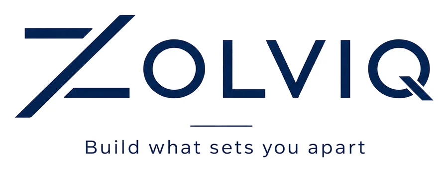
The open Z
Two horizontal bars that just miss the diagonal: the Z deliberately leaves space open. Air, light and accessibility: architecture that opens up instead of closing in. A lowercase tagline keeps it human.
Architecture
Build what sets you apart.
Zolviq designs architecture that sets clients apart. The logo had to do the same: clear, precise and confident, without decoration that distracts from the work. We presented three concepts, all built on the same foundation: the diagonal Z as a construction line, a geometric typeface and deep navy blue.
The concepts
Concept 1
Two horizontal bars that just miss the diagonal: the Z deliberately leaves space open. Air, light and accessibility: architecture that opens up instead of closing in. A lowercase tagline keeps it human.
Concept 2
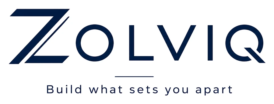
The diagonal is drawn twice, like two layers of one structure. Robust and built, with mass the way a facade has mass. The heaviest of the three, with maximum impact at small sizes.
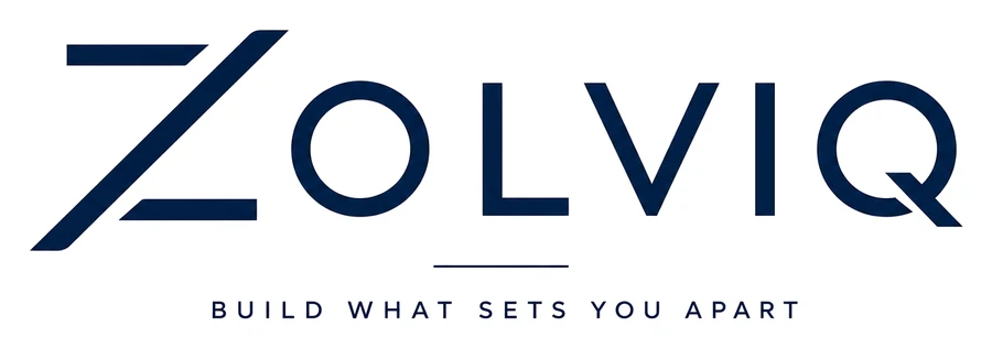
Concept 3
The sharpest cut: thin bars, a stretched diagonal and a tagline in capitals, like lettering on a building. Formal, precise and timeless.
Colours
Deep navy carries the brand; silver grey and paper white give it room to breathe.
#021F46
The brand colour
#D0CCCB
Watermarks, as on the business cards
#F7F5F2
Paper and backgrounds
Typography
Poppins
Geometric, open and constructive: the same language as the mark. Capitals for headings, lowercase for body text.
In use
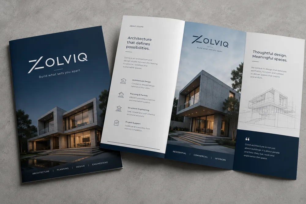
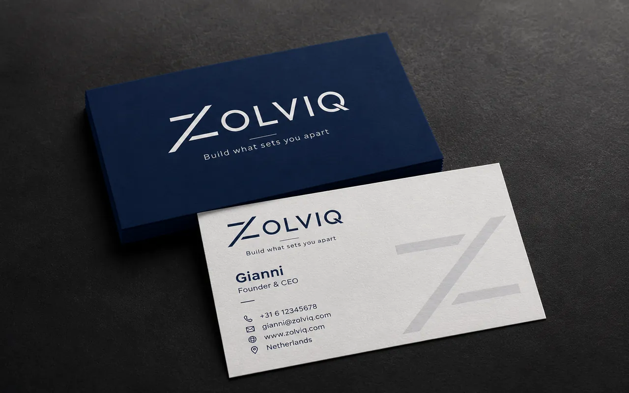
Concept 1: the lowercase tagline carries the human tone.
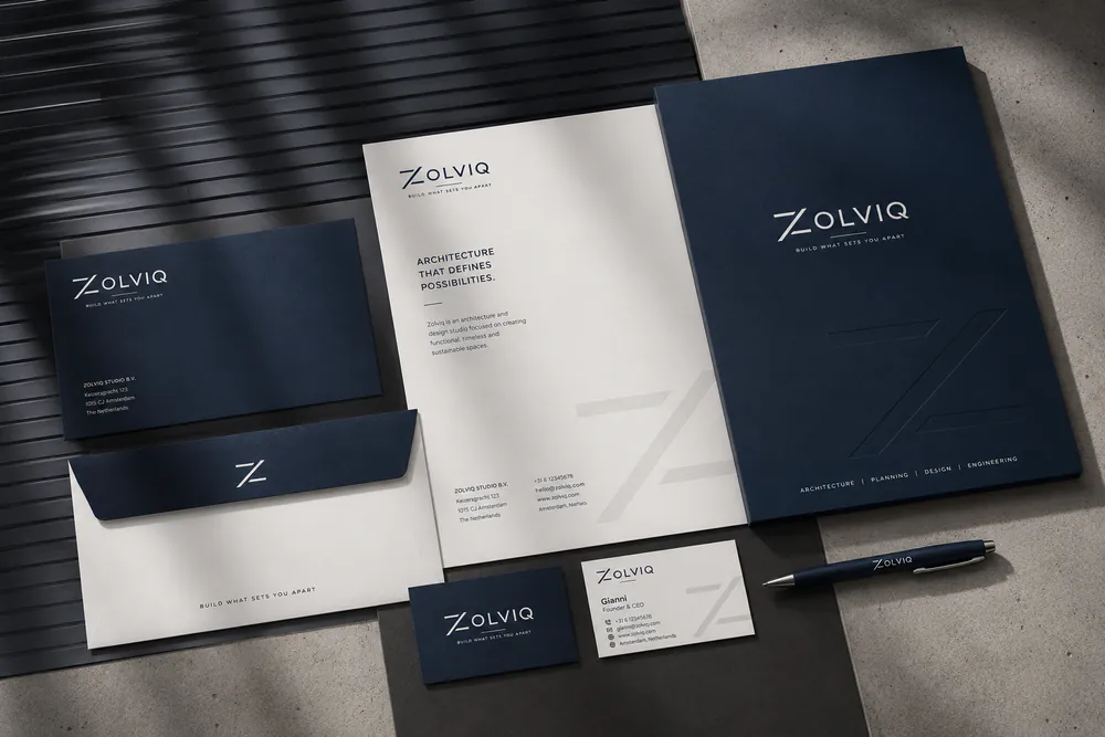
Concept 2: one construction, every surface.
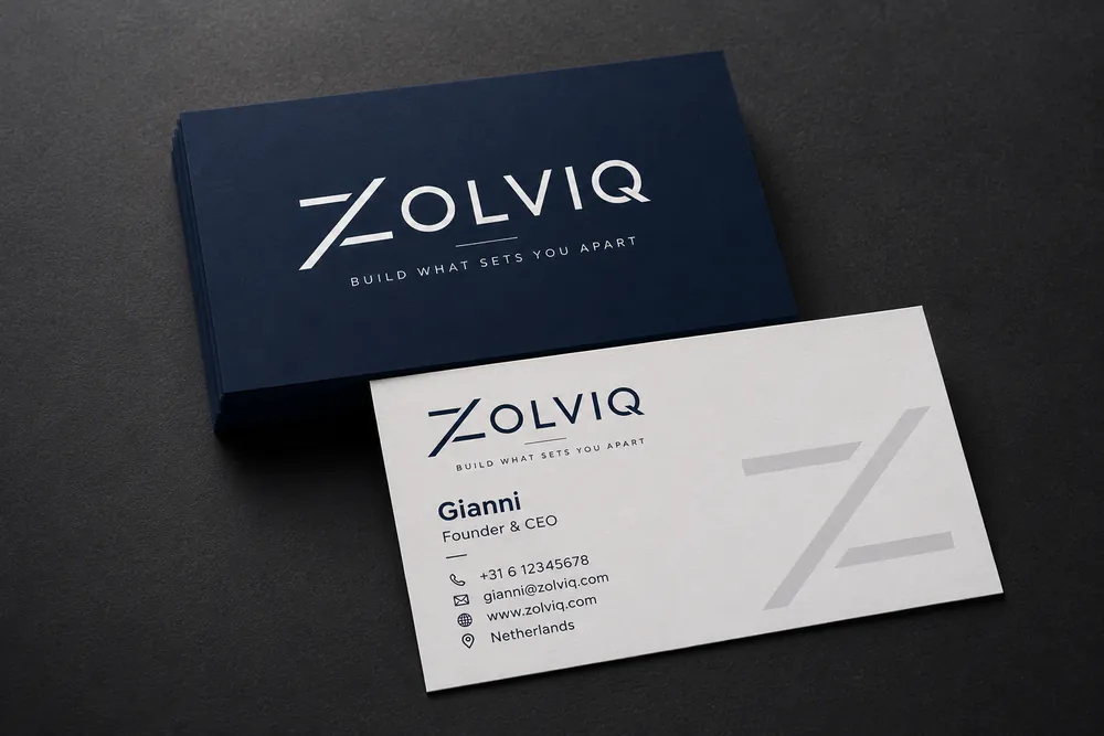
Concept 3: capitals give the card a formal signature.
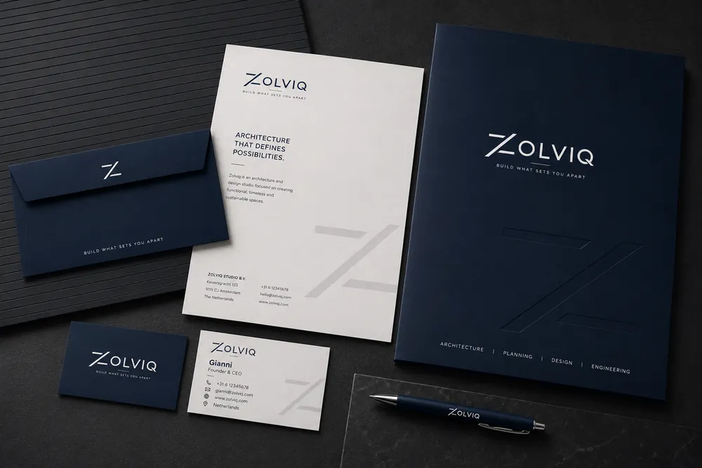
Concept 3: embossing makes the Z tangible.
Download
All three options with their mockups, in one PDF.
PDF · 1.3 MB · in Dutch
Portfolio
Software / IT
Modern, clean logo for a task flow management platform.
View brand identity →
Technology
Friendly, approachable logo for an identity verification platform in Suriname.
View brand identity →
Civic platform
Trustworthy logo for a citizen reporting platform in Suriname.
View brand identity →
Barbershop
Classic, sign-style logo for a neighbourhood barbershop in Paramaribo.
View logo design →
Custom printing & gifts
Colourful logo options for a creative studio that turns products into gifts.
View logo design →
Construction
Bold logo options for a construction company in Guyana.
View logo design →Custom. Strategic. Timeless.