Software / IT
Workflow logo & brand identity
Work, framed. Flow, unbroken.
Workflow is task flow management for organisations that can't afford dropped balls: one platform where every task is created, assigned, tracked and closed, on web, Android and iOS. The identity holds that promise in one image.
- Industry
- Task management software
- Delivered
- Complete brand identity
The logo
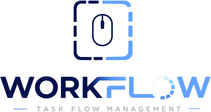
Read it the way it works.
WORK is set in deep navy: the effort, the part that needs focus. FLOW answers in bright blue: the result everyone sees. The F and L are drawn as one continuous stroke, so the flow runs through the letters the way a task should run through a team: handed over, never dropped.
And the O is not an O. It's a progress ring caught mid-task, with most segments already filled: the promise of a dashboard, hidden in a letter.
The icon
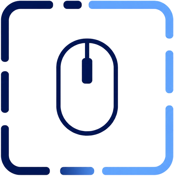
A workday in one square.
At the centre is the mouse: the click that starts every task. Around it, a time border divides the day into segments and holds the work in frame, with gaps for breathing room. The colour runs from navy to bright blue, the same journey every task makes: from to-do to done.
Drawn on a square grid, it scales from a favicon to a building sign.
Colours
Two blues, one journey.
The palette is the gradient in the logo, taken apart: work navy at one end, flow blue at the other. Dark where you think, bright where you act.
Work Navy
#081E5B
Focus, depth, the heavy lifting
Flow Blue
#1E6EFF
Action and the main buttons
Signal Sky
#8EC5FF
Highlights, links and light touches
Slate
#6D7482
Captions, taglines and quiet UI
Typography
The grid and the current.
Geist Bold
The typeface of the wordmark: modern and geometric, built for software. Used for headings.
Manrope
Carries the reading: UI labels, documents and the wide-tracked tagline.
In use
The brand at work
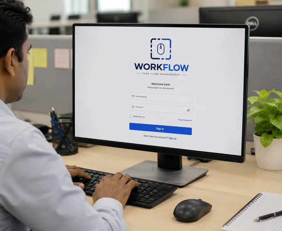
The first click of the day.
The sign-in screen is the brand's front door: the logo centred, one blue button, everything else out of the way.
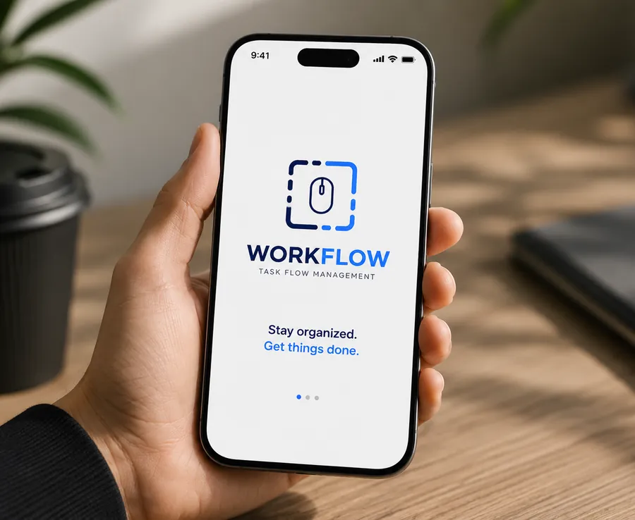
Flow, pocket-sized.
Same mark, same two blues, same quiet screen. When the identity is this consistent, the app never has to introduce itself twice.
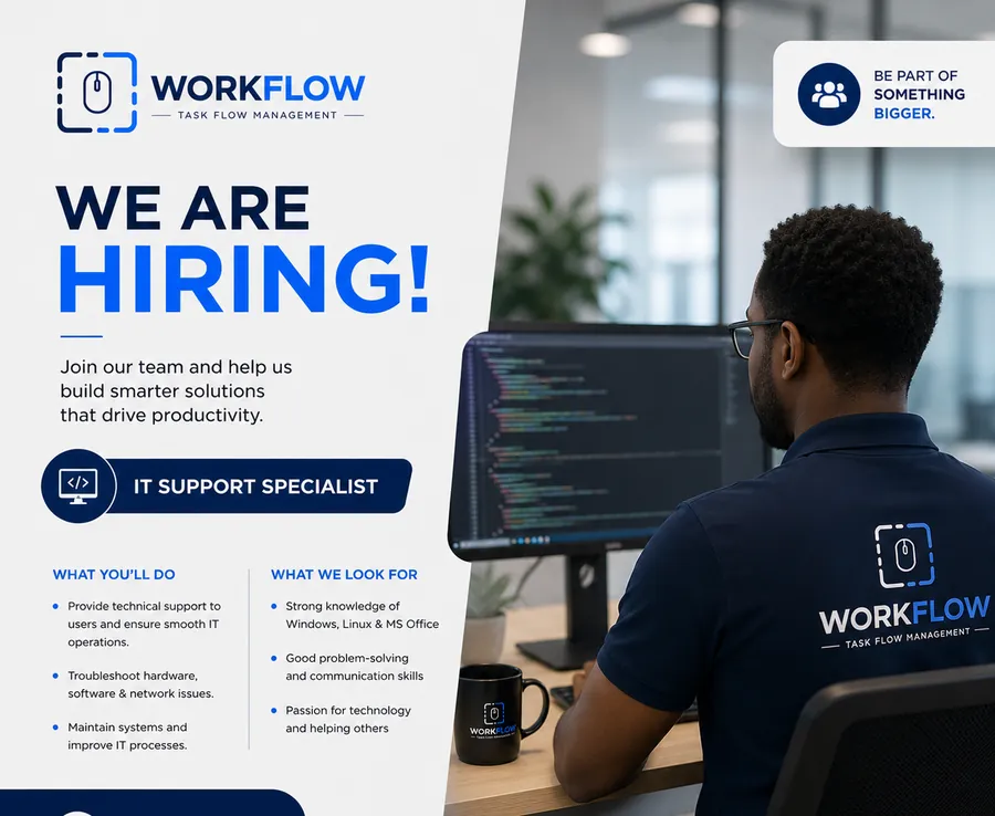
The brand hires like it ships.
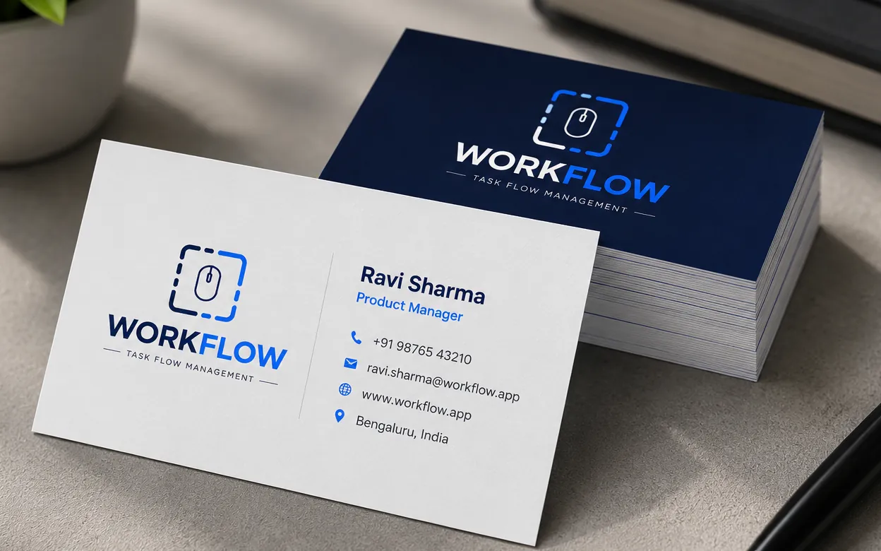
A vacancy post built entirely from system parts: the two blues, the rounded panels and the icon as a stamp of origin.
Download
Explore the complete brand identity
Logo variations, colours, typography, logo rules and real-world examples, all in one PDF.
PDF · 1.8 MB · in English
Portfolio
More logos we designed
Technology
SuVerify
Friendly, approachable logo for an identity verification platform in Suriname.
View brand identity →
Civic platform
WijSamen
Trustworthy logo for a citizen reporting platform in Suriname.
View brand identity →
Barbershop
Frank & Harry
Classic, sign-style logo for a neighbourhood barbershop in Paramaribo.
View logo design →
Architecture
Zolviq
Precise, confident logo concepts for an architecture firm.
View logo design →
Custom printing & gifts
Novaria Designs
Colourful logo options for a creative studio that turns products into gifts.
View logo design →
Construction
Builders R Us
Bold logo options for a construction company in Guyana.
View logo design →Custom. Strategic. Timeless.